
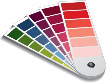
 The Pantone Matching System or PMS is a brand of color matching system that is the gold standard of the printing industry. Print professionals and designers use it to ensure that they are all referring to the same color. It takes the guesswork out of using color in printing.
On each color chip in the Pantone formula guides is an identifying number used to reference the color, followed by a letter signifying the type of coating. Below that is a mixing formula used by press operators to blend the ink to match the color on the chip.
There are multiple color groups in PMS called “palettes.” The most commonly used group is the Solid Color palette. In addition to those palettes for printing CMYK process color on paper, other palettes include a plastics palette specifically designed for color accuracy when printing on plastics, and a textile palette for ensuring the correct color when printing on fabrics.
For businesses, consistency is very important for their image. This is why major companies use Pantone colors to achieve uniformity in their company branding. They can choose specific Pantone colors and provide them to designers or printers who work with their branding.
Color is by its nature filled with inconsistencies in how it is perceived. Computer monitors, printers, ink, paper and the human eye are all factors that can affect the way a color appears. The Pantone Matching System was developed to provide consistency in perception, streamlining the process of working with a printing professional.